GROCERY RETAIL UNIFICATION
Supporting omni-channel shopping across six grocery retailers
11 months
In 2024, Empire partnered with IBM and Adobe to modernize the digital experience across six grocery banners, including Sobeys, FreshCo, and IGA Quebec. However, most grocery purchases still happened in store — revealing an opportunity to move beyond a traditional eCommerce model and toward an omnichannel experience.
I helped lead the end-to-end product strategy that bridged meal planning to in-store shopping that personalized online shopping experiences for existing Scene+ and new users.
I helped lead the end-to-end strategy across all pod workstreams. I supported product evolution by leading concept testing, innovation ideation, design, information architecture, and systems design.
I also led cross-functional coordination with merchandising, marketing, and Adobe to deliver a scalable CMS experience supporting B2B2C needs.
Empire, one of Canada’s largest grocery conglomerates, lagged behind competitors in the online space. At the time, shoppers could only browse products by leaving Sobeys.com and navigating to the third-party platform Voila.ca.
However, on Voila, the product pricing and inventory often did not reflect what was actually available in-store.
Our objective was to increase website stickiness while driving meaningful conversions from digital browsing to in-store shopping.
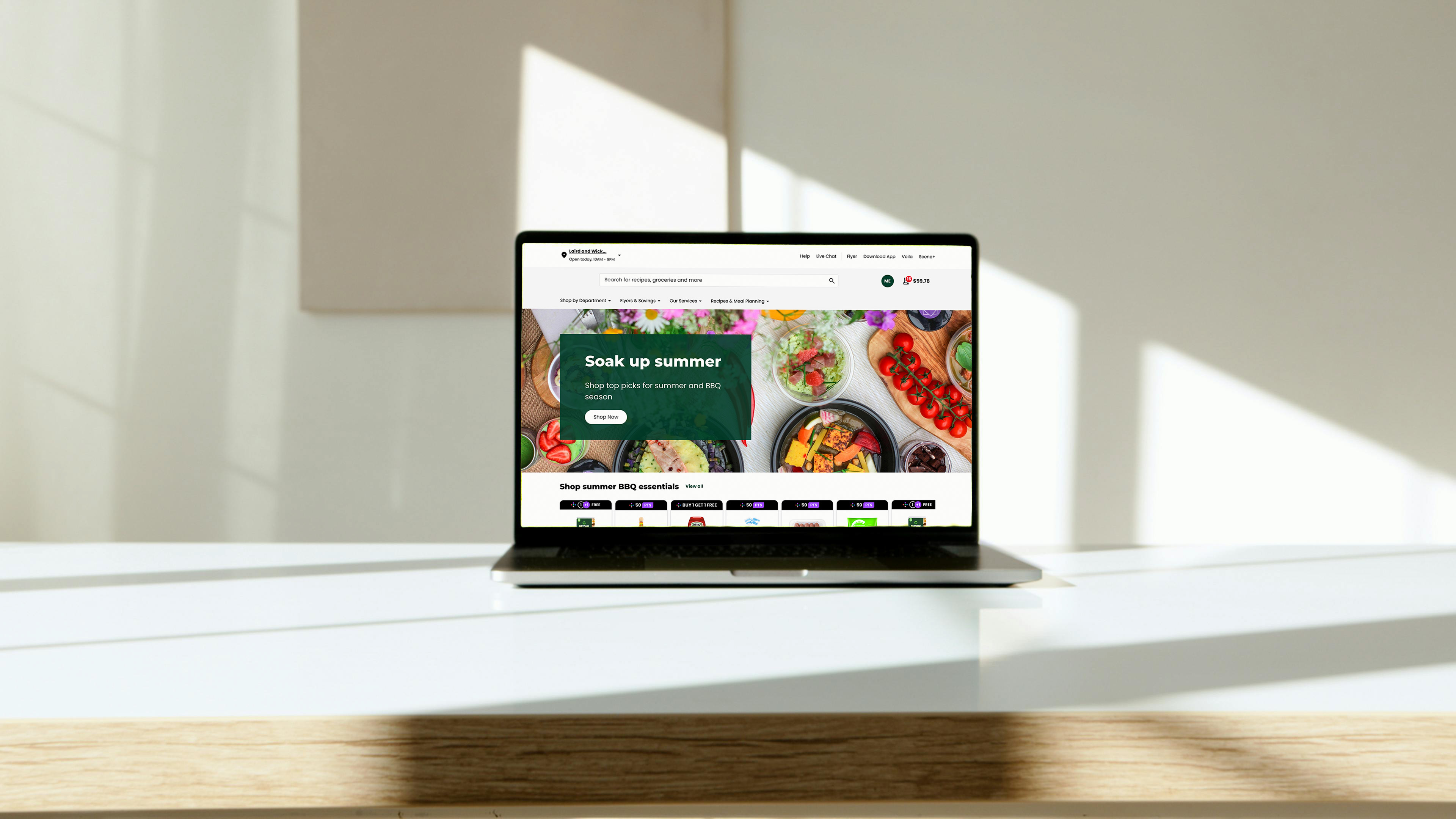
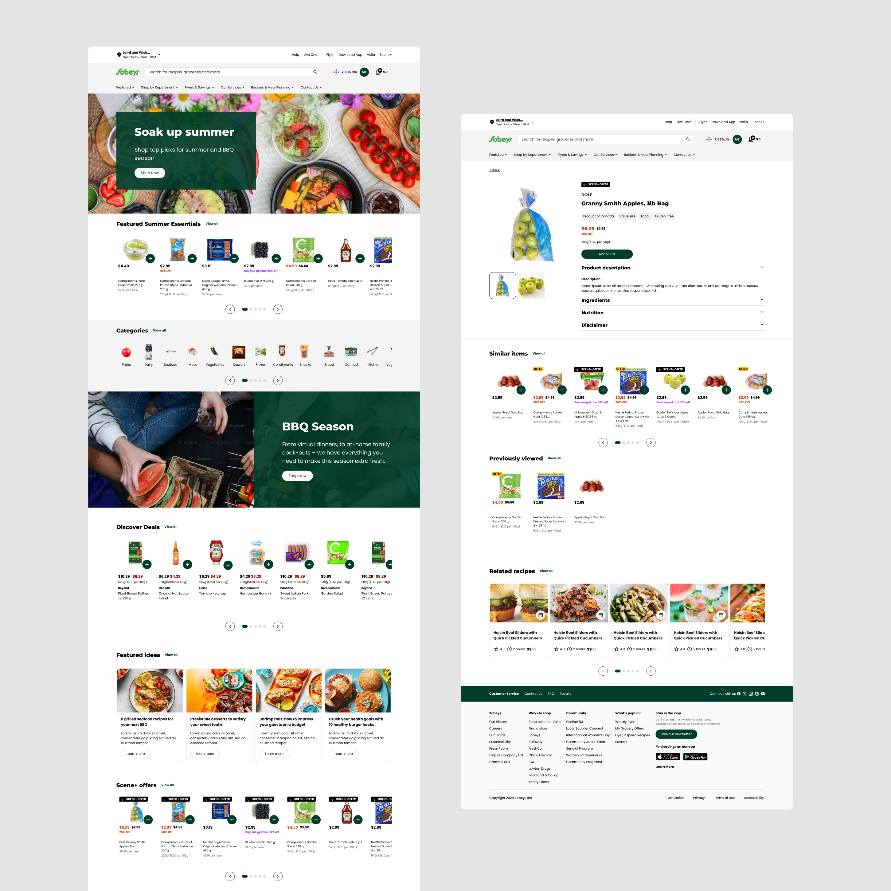
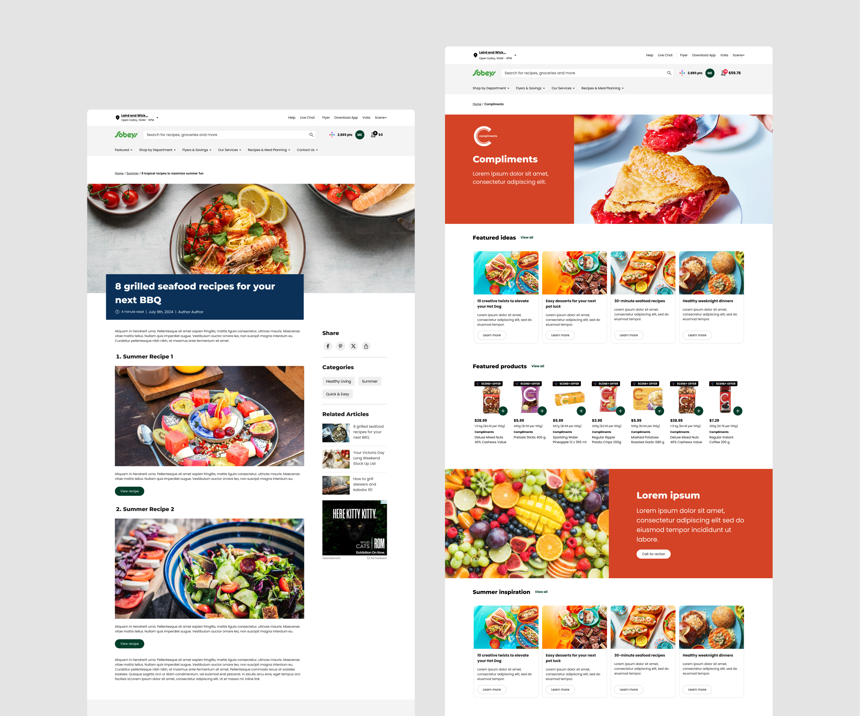
The Sobeys website was reimagined as a digital flyer within a broader lifestyle-driven grocery journey, encouraging customers to browse, plan, and ultimately purchase products in-store.
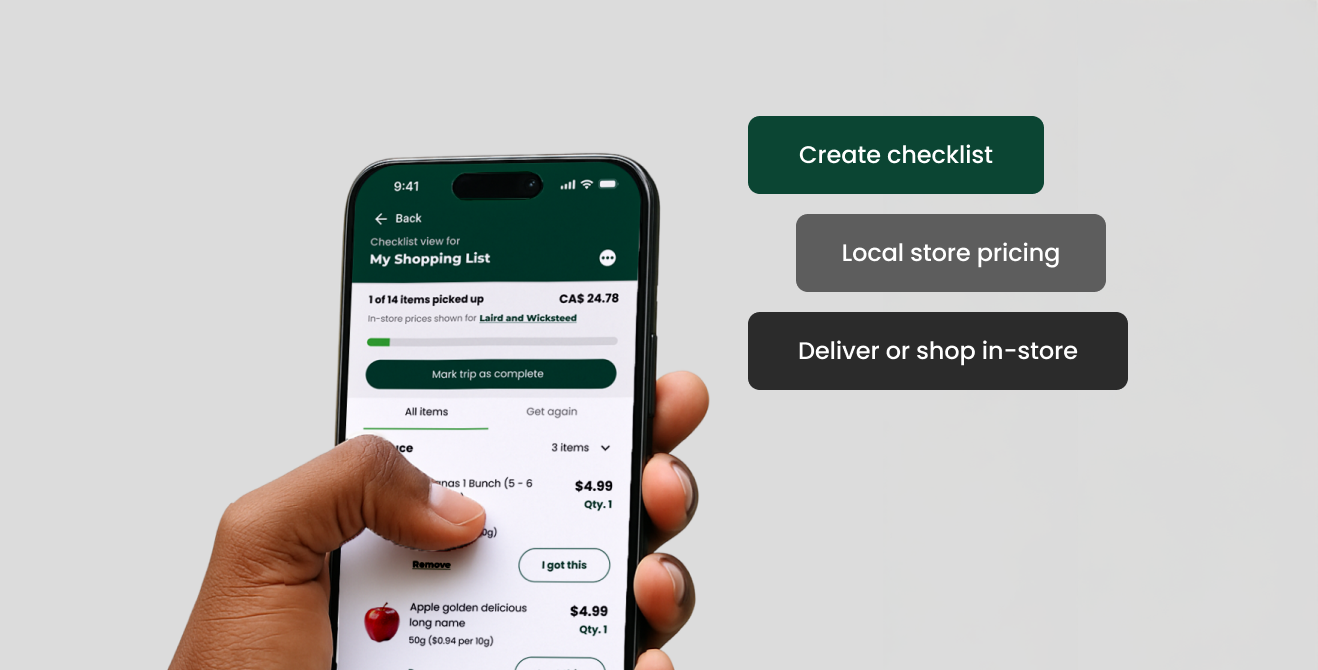
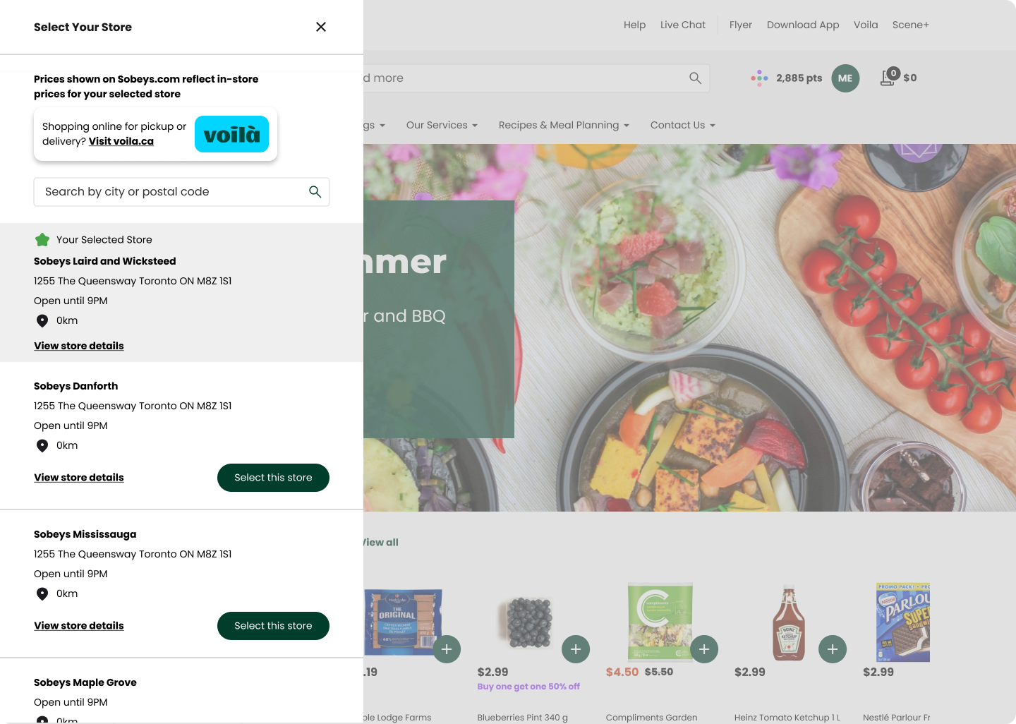
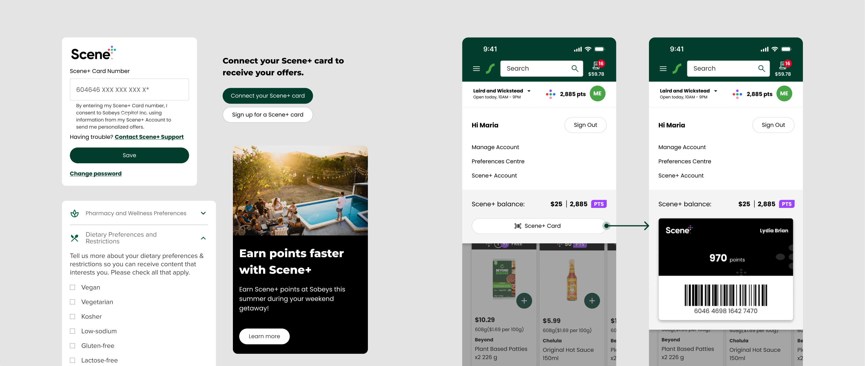
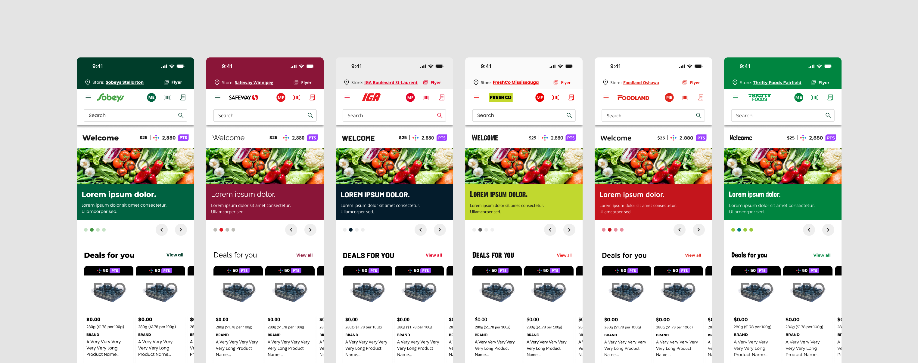
View local products & pricing
With pricing varying by store, we enabled shoppers to see store-specific products, pricing, and available services across 245 locations.
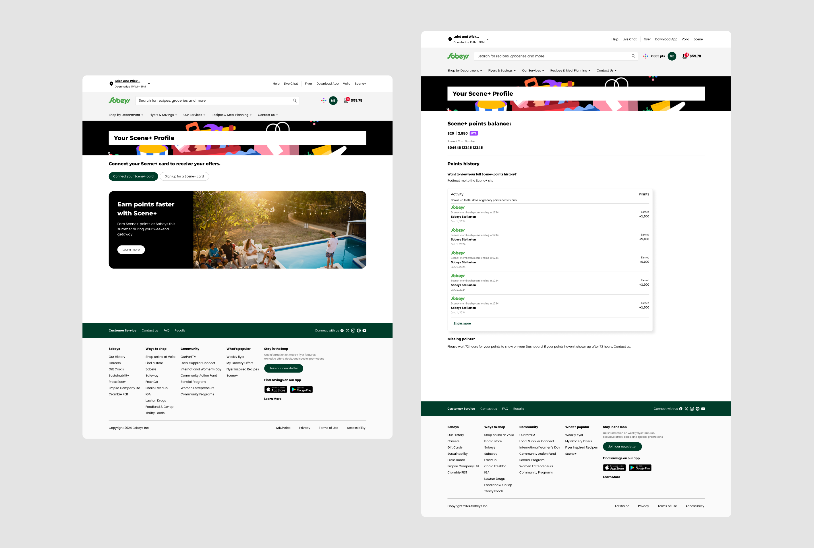
Track Scene+ points & exclusive member offers
Previously, customers couldn’t see their points balance. Now, they can shop, track, and redeem rewards in one place.

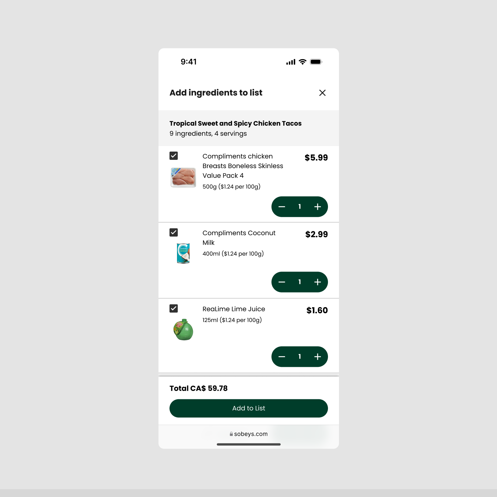
Customers can build meal plans and discover new recipes that convert into a ready-to-shop list, with flexibility to choose alternative products by swapping ingredients. This drives larger baskets and creates upsell opportunities.
We needed to establish a baseline understanding of adoption drivers for the new online experience. Grocery websites were treated as just another touchpoint within a broader meal-planning journey — they consulted recipes, flyers, budgeting apps, family members to develop a shopping list before entering the store.
Top opportunities prioritized after 20 contextual inquiries:
Reduce the mental load of meal planning decisions
Participants often swapped items for deals or alternatives, which left them uncertain about what meals to prepare, which prompted them to figure out a new plan.
"What can I cook with the different products I picked up?"
Inspire new ways to use products
When viewing product details, shoppers liked recipe ideas on physical packaging, which are often not shown in online shopping.
"How can I spice up the high-protein yogurt I usually buy?"
"I found an interesting new product but don't know what to do with it."
Catering to individual preferences & dietary needs
Social media was the most common source of recipe inspiration. Participants often discovered recipes by chance. These encounters were effective because AI-driven recommendations catered to their preferences.
"My son sends me recipes that he finds on Instagram... They are quick and easy meals."
While Sobeys provided market segments as a proxy for understanding website users, I thought it would be helpful to distinguish demographic customer behaviours from user behaviours after.


As it turned out, the market segments did not map 1:1 to personas. Interestingly, there were overlapping user behaviour patterns despite varying preferences and lifestyles. I was inspired by Microsoft's Inclusive Design Method and developed a 'persona spectrum'.
*A persona spectrum (or “spectrum of needs/behaviours”) recognizes that shoppers don’t fit neatly into one bucket; many grocery shopping behaviours are subject to change depending on circumstance.
By understanding different online shopping behaviours, we identified how to design entry points for personalized recommendations that align with user intent — starting from exploratory browsing to targeted searches for specific products or recipe content.

I collaborated with service designers to reimagine new experience opportunities — including meal planning support, shopping list curation, onboarding, loyalty, and checkout. Together, we developed 12 service blueprints that defined MVP priorities and mapped a long-term vision across key customer journeys.
Our goal was to accommodate growing content, build consistency, and provide shoppers with predictable navigation. We accomplishes this twofold with 1) a standardized site structure and 2) developing a robust design system.

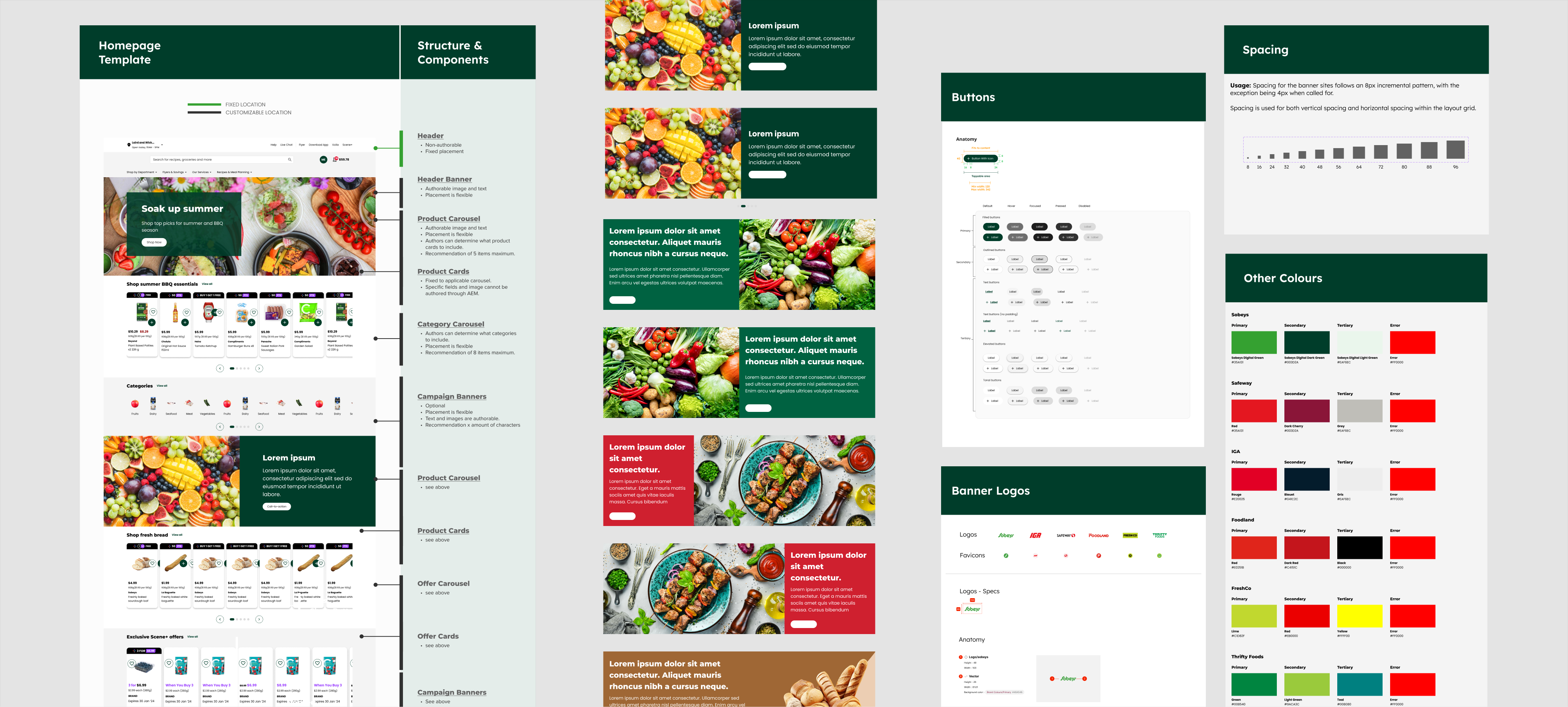
Collaborative whiteboards served as living documents that visualize stakeholder feedback and decisions regarding design, content, and system logic.

As the product evolved, our validation needs shifted. Under tight timelines, I rapidly prototyped and ran 8 usability sessions per sprint to uncover friction and guide decisions. I worked alongside researchers at Sobeys’ Research Centre in Halifax using eye-tracking and sentiment insights.


Before
For product cards, we initially emphasized the brand and product name. Sobeys believed their primary customers were not price-sensitive, so we set out to test this assumption.
After
We elevated price placement based on eye-tracking and brain excitement data, shortened card layout with a revised button, and added item-count feedback for clearer interaction.
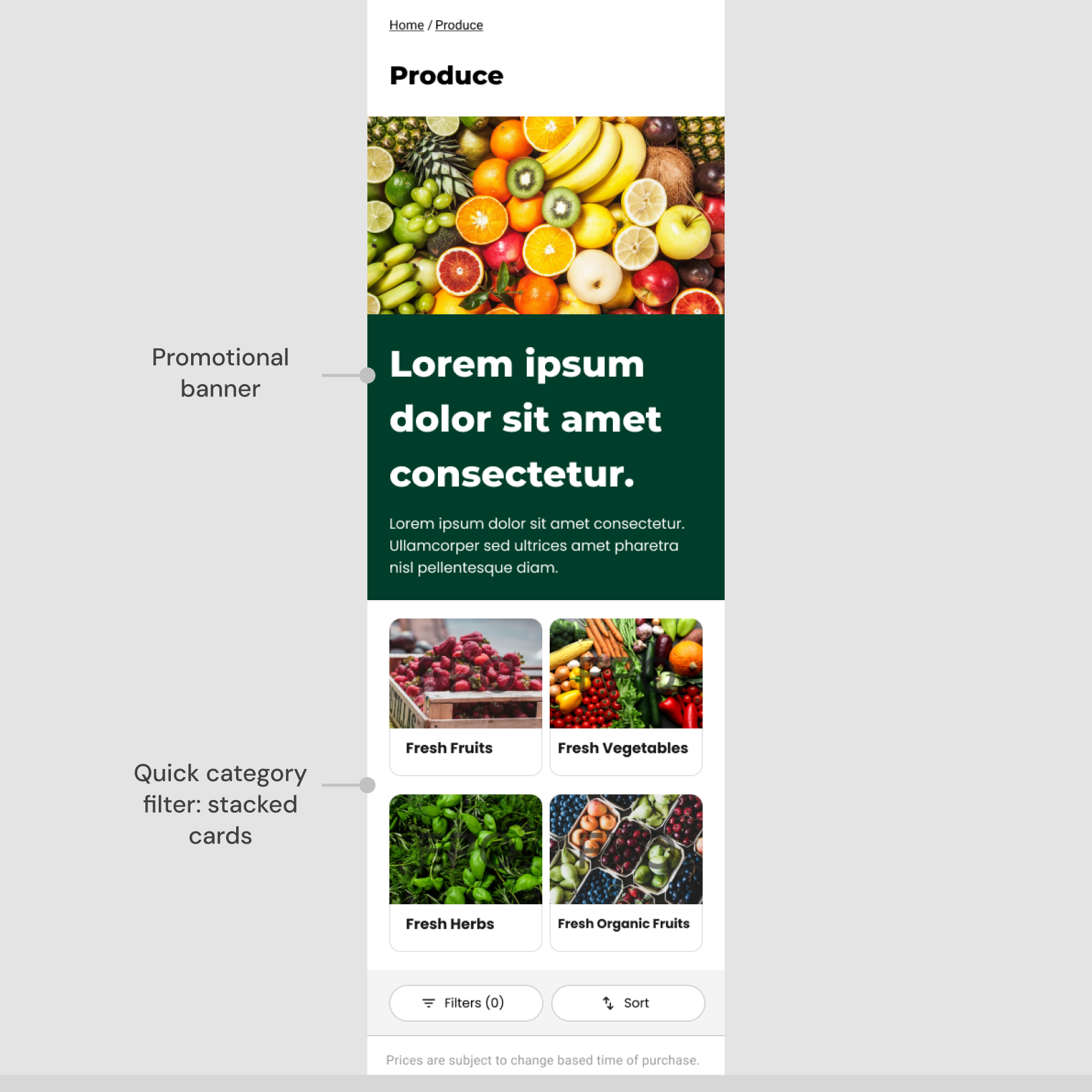
Before
Retailers considered using promotional banners on category pages. To encourage browsing and gradual exploration, we added category filters for progressive product discovery.
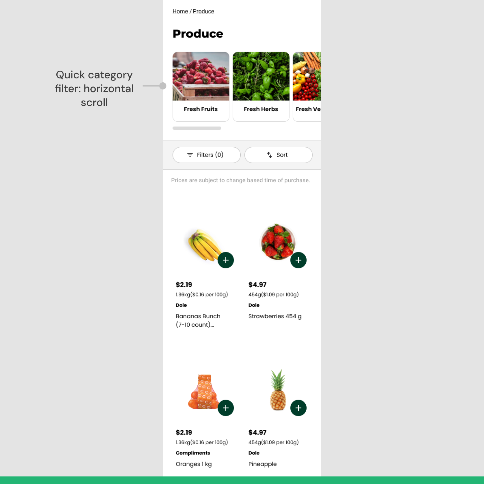
After
The promotional banner disrupted product exploration, so we removed it. Similarly, we also changed the 'quick category filter' to improve browsing and product visibility.
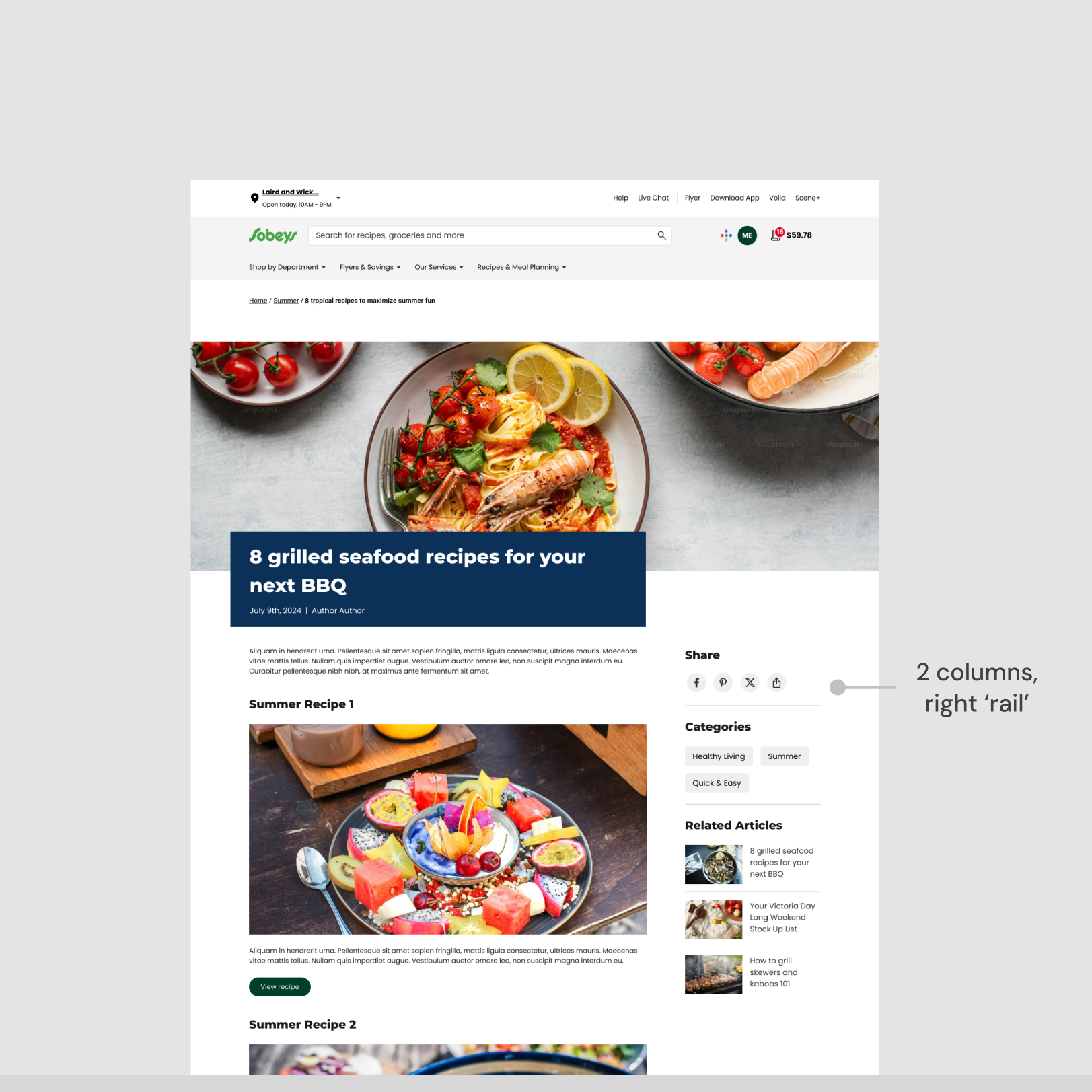

Before
For article pages, we explored layout options. A sticky right rail provided constant access to interactive components but reduced the available space for important article content.
After
We chose a one-column, centered layout to draw greater attention to the article content itself. This improved readability while highlighting embedded recipes and products.
Before
On the recipe page, we introduced an 'add ingredients' feature that allowed shoppers to select or deselect individual products before adding them to their cart.
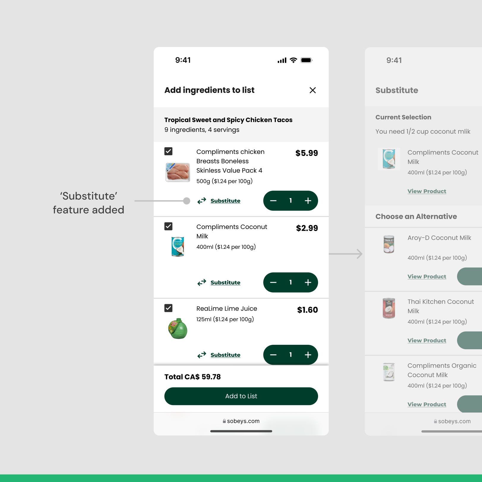
After
To maintain flow and retain users on the screen, we also included a “substitute” option enabling shoppers to swap ingredients without interrupting their shopping process.
The redesign of the website as a result of the product catalog integration was a big win for our team. Standardized CMS templates empowered Empire marketing teams to scale and manage content efficiently, while providing customers with a new lifestyle-based online shopping experience.